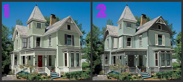
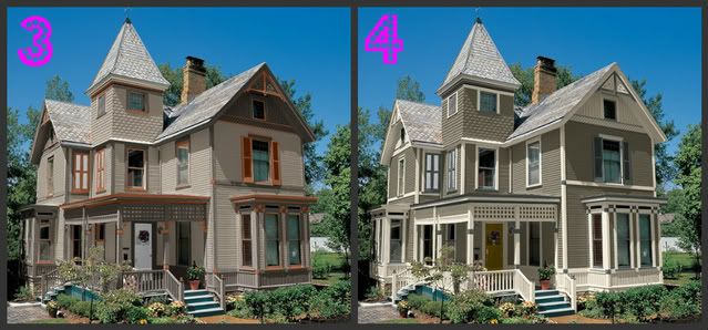
I have some issues with this house. For one thing, for the most part three of the four sides will basically be one main color and a trim....soooo, I really have to like the main color and trim. The accent color will look nice on the front/corner, but driving up to it from all other angles must make me go "ahhhh, I love that color" everytime I see it. I'm just like that I guess.

I like the crispness that comes with a nice white-ish trim, but I like the traditional darker trim used for older houses, esp. painted ladies.
The shingles are gray as pictured, so the colors have to go with those. And I want the door to contrastingly blend (I think I made that up).
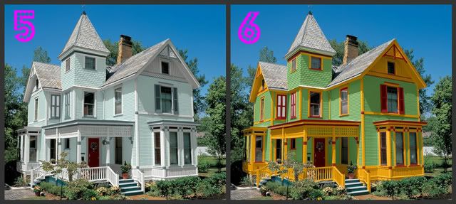
With those items in mind, would you PLEASE take a moment and VOTE for the color scheme you think we should paint our house? I wish I had some fun giveaway or link-up, but I've really just got to get this done and the fun system of picking would require hours of figuring out how to pull one of those things off! PLEASE, even if you've never come out and commented before...lurkers...just leave a number of your choice. Thanks everyone!


About #6. That is for my babe. He really wants to paint it the most annoying colors possible...cuz he's like that. It is growing on me. YIKES!

I like number 6 too.. Stacy.. sorry lol
ReplyDeleteConnie...is that you??? Of course you like #6!
ReplyDeleteLillian....didn't you see the RED door??? :)
My favorite is #2 (because I just picked out those colors for my scrapbook studio/office). After that, I like #3 and #1 equally.
ReplyDeleteExterior improvement of your home is as important as the interior of home you should not ignore the exterior of your home. thanks for sharing the points that you shared here..did get good information from here.
ReplyDeleteLandscaping Sydney
I wanted to thank you a lot more for your amazing website you have developed here. It really is full of useful tips for those who are seriously interested in this specific subject, especially this very post.
ReplyDeletepainting santa cruz
What did you choose? I know I’m kind of late for this poll, but I’d like to cast my vote for either 3 or 5. Numbers 1 and 2 kind of look similar, likewise with 3 and 4, while number 6’s color-scheme is kind of risky. Jesse @ JonWrightRoofing.com
ReplyDelete